Client
眺港 | Tiao Gang
Taiwan
2021-2022
Project
Branding
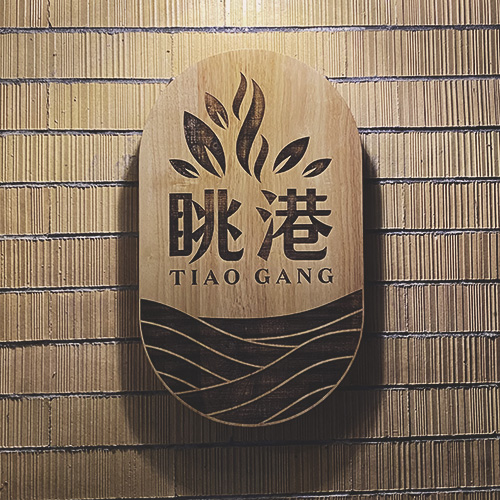
Logo design
Sign design
Interior design
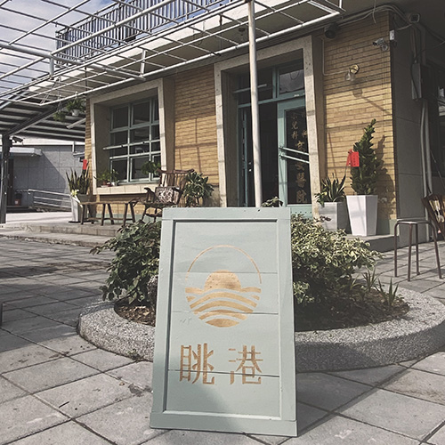
This project included a wide range of design: branding, logo/sign design, overall interior design.
The place used to be a small hospital in Chenggong town and the Tiao Gang (眺港) Café owners wanted to include the old look in their café interior design. The color palette was chosen from original colors (blue green color in doors and windows) and were combined with its compliment color pinkish red. The wooden structure/colors were chosen to be the main furniture element.
About the logo:
The word Tiao Gang (眺港) literally means “to (over)look to the port”; café’s door is pointing to the Chenggong harbor/The Pacific Ocean. Tiao Gang Café offers coffee and tea drinks with with a hint of Chinese herbs. The logo combines the ocean (waves) the herbs (with steam).
 Lumidesign
 Lumidesign