Client
- Anita’s Hot Sauce
- Taiwan
2025
Project
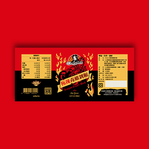
New label design for Scorpion Pepper Mash.
The colors red and black were chosen to provide contrast and create a sense of hot sauce. Design elements such as flame effects add to the sense of spiciness and professionalism. The font was chosen to be an old-fashioned Sans Serif font for both English and Chinese to reinforce the spiciness of the product.
 Lumidesign
 Lumidesign
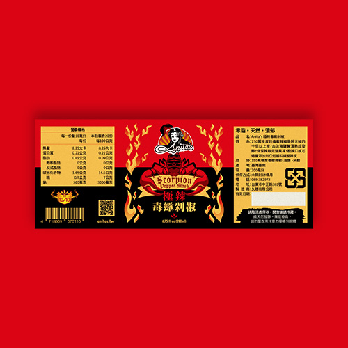